The goal of all evaluations should be to create transparency. Especially in areas where the current state of knowledge is accepted as given or where the data has not yet been prepared in such a way that it can be interpreted meaningfully. An insight into how data can be structured is provided in the first part of this series of articles.
Only a few evaluations are needed to identify potential for optimization. These can be used to achieve significant performance improvements or to draw conclusions about possible bottlenecks in the warehouse. Using the example of a virtual company, we will demonstrate several analysis steps.
The order position quantity analysis
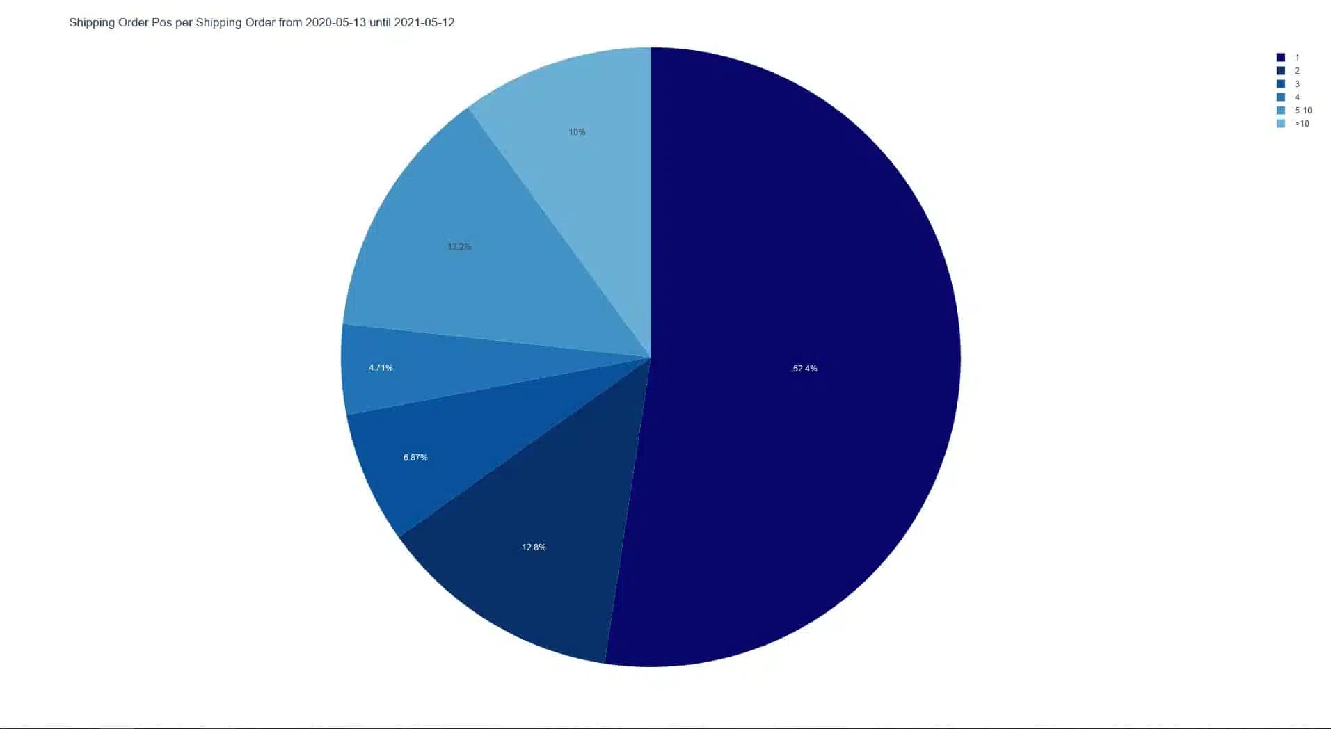
A simple first step is to evaluate how many order items are included in each order. In this case, it can be seen here that in the example warehouse, many orders (52.4%) are received with only one item.
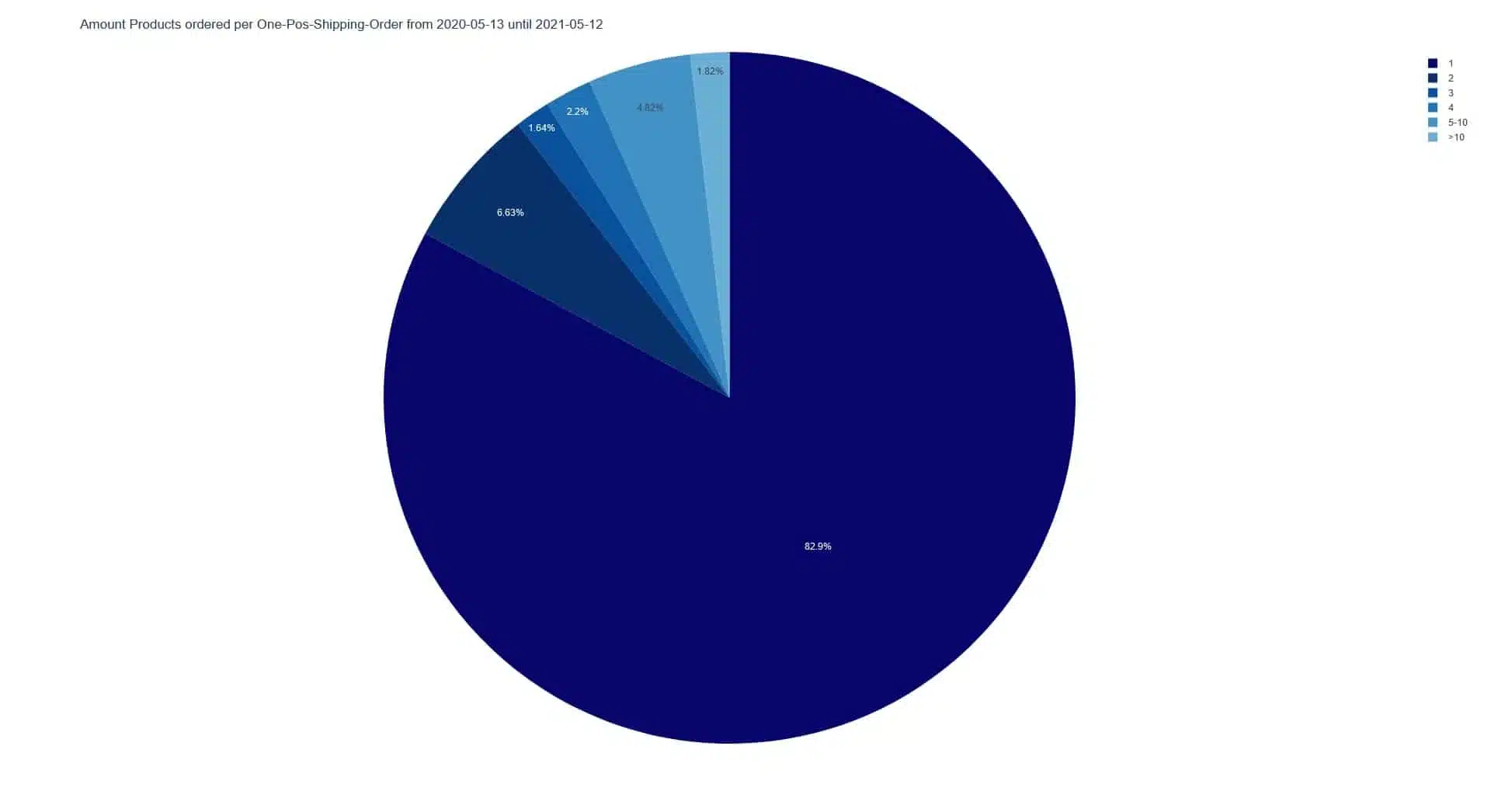
A closer look at the orders with only one position shows that they also contain only one object in 82.9% of the cases. One position can also contain several objects of the same type, so the distinction is relevant here.
If we now put these two evaluations together again, we see that more than 43% of all orders have only one item with quantity 1. From this, one can conclude that a separate processing of these orders may be reasonable.
What insights a look at the product range stability can provide
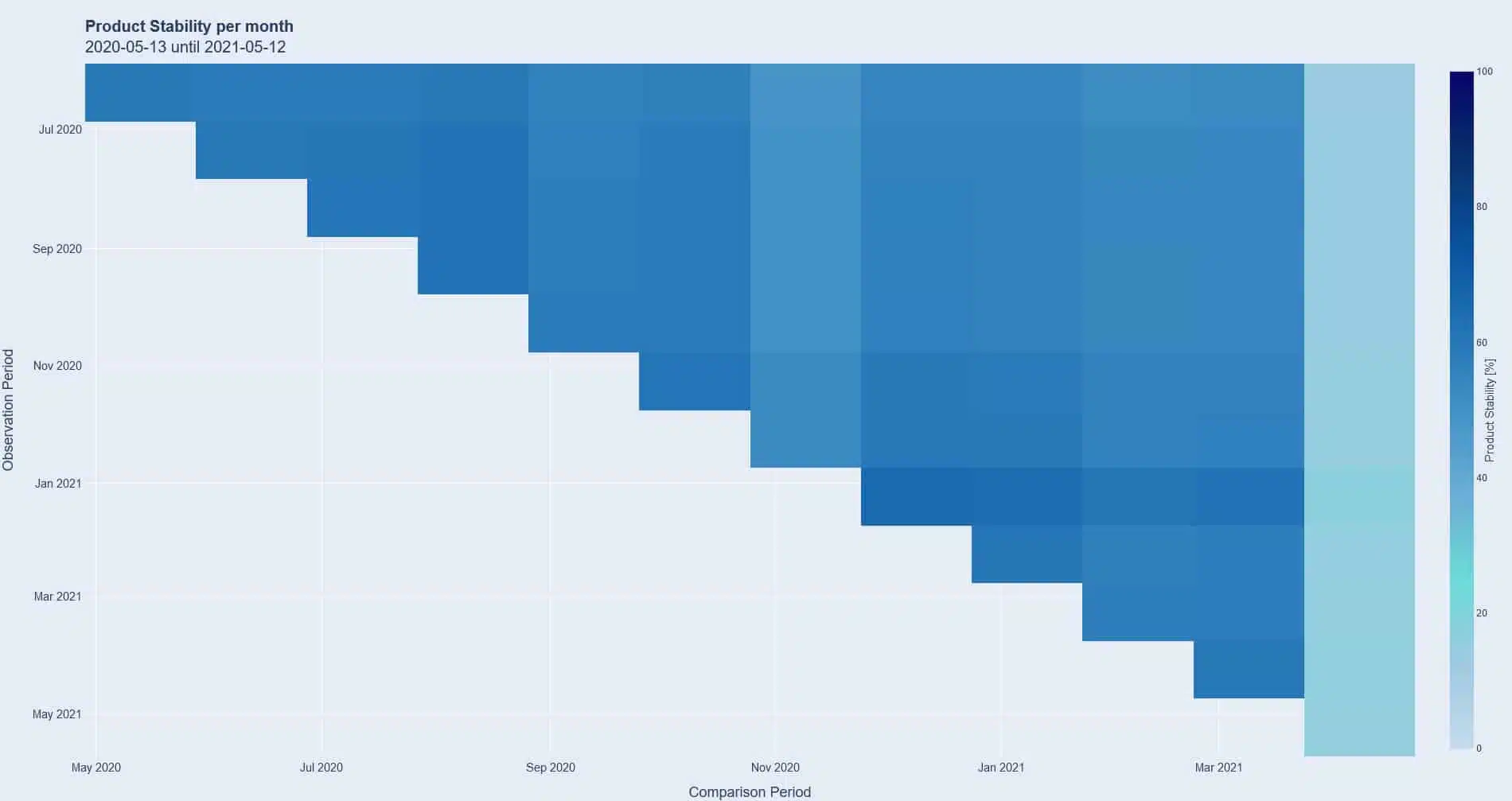
Another valuable entry point into the analysis of processes in a warehouse is the stability of the product range. Knowing whether many items are sold there permanently or whether they are subject to strong fluctuations is an important first step in identifying the context behind this and deriving recommendations for action. For example, is the fluctuation seasonal or event-related? Is there only a summer and winter season or do all four seasons have an impact? Are any external as well as marketing driven events recurring triggers? For example, a fairly new event, such as Singles Day, can also have an impact on suppliers who do not actively promote this day, but offer products that match the occasion and thus passively benefit from the attention generated by the media.
From the graph above, it can be seen that about 60% of the assortment is permanently the same and sold. The light blue bar on the right hand side can be explained by the timing of the analysis, as a half month is compared to the previous full months. In this case, the resulting high-contrast diagram is intended to serve as an illustrative object that makes it clear that the choice of time periods can also have an influence on the presentation of the evaluation that should not be underestimated.
This evaluation is followed by further analyses, combined with project-specific knowledge, in order to draw the right conclusions based on a context that is as thoroughly prepared as possible. But even without detailed background knowledge, we can already make initial recommendations:
- This 60% of the assortment could be arranged in a way that shortens the distances for the pickers. The likelihood is relatively high that orders will contain several of these items, and a shortened walking distance will thus increase performance. However, it is of course again necessary to consider project-dependent framework conditions, such as whether items may only be stored in certain areas, because they are, for example, hazardous materials or hanging goods.
- Another approach could also be that especially these articles, which are purchased permanently, get fixed places in zones and several zones have the same article, which reduces the walking distances of the pickers, since there are now several points of access for the same article.
Conclusions from the relationship between picks and aisles in a picking run.
The ratio of picks to aisles within an aisle allows conclusions to be drawn as to whether an existing route planning solution delivers efficient solutions in the long term.
An extreme example in terms of optimization potential would be if aisles were formed in such a way that each item would generate its own aisle for all open orders. In this hypothetical scenario, pickers would go to an aisle, pick an item, deliver it, and then start over. The ratio of pick to aisle per pack aisle here would be one-to-one, making it highly inefficient in terms of time and staffing. In cases of an express shipment or a quick re-delivery of missing parts from an order that must be finalized before the cut-off time, such scenarios may occur and be desirable to avoid disruptions in other critical process steps.
A counterexample to this first scenario would be a warehouse where as many pickers as aisles are available for planning. Thus, a routing algorithm could form rounds in which all picks are in an aisle. This significantly increases the ratio of picks to aisles; instead of a one-to-one distribution, it is now x to 1. Warehouse personnel would only need to move in one aisle each and thus would be very efficient in terms of the ratio of distance traveled to work steps performed.
Typically, most warehouses aim for a ratio of several picks per aisle to keep efficiency high and avoidable exertion low.

Analysis of the ratio of picks to aisles per pick round in this chart shows a distribution that suggests potential for improvement. Although the majority of the pick rounds have a good ratio of over nine picks per aisle, many rounds have only one or two to three picks per aisle entered. It is worth taking a closer look at these first two points in the diagram, as well as conducting subsequent research into the causes: further analysis would be used at this point to check whether it is work processes that necessarily have a poor ratio, for example because they are critical express orders, or whether work needs to be done on the route planning.
Especially in this last diagram, it is evident that the combination of the right metrics and analysis objects provides transparency and reveals irregularities that can be investigated further or remedied directly.
However, the prerequisite for this in all cases is that the accumulating historical data of the warehouse is aggregated at regular intervals and in high quality: Short time horizons are often only a snapshot of the whole, from which only insufficient or even false conclusions can be drawn, as a supposed correlation can turn out to be mere coincidence when looking at a larger time span.
A short excursion into practical data analysis using Google Trends
Google Trends is a freely accessible tool that can be used to examine the development of search queries from 2004 to today. Journalists therefore also like to use this tool to back up their articles with data. In 2016, an article went through several media outlets reporting that shortly after the Brexit in the UK, the search query “What is the EU” shot through the roof.
- On the NPR radio network, the headline was “After Brexit Vote, Britain Asks Google: ‘What Is The EU?'”
- The Businessinsider.com platform also reported “UK voters are Googling ‘What is the EU?’ – right after voting to leave the EU” with an appropriately dramatic image.
But the authors of both articles made a mistake: In Google Trends, only relative values are displayed in the form of percentages. In other words, if no one searches for “What is the EU” before Brexit, the level is logically 0. If users in the United Kingdom search for it 100, 1,000 or 100,000 times after the Brexit, the level always increases as shown in the chart. Consequently, how many Britons actually searched for it is an unknown quantity here.
A remedy to get a better view of the situation with available means is to use a control term. Since it is well known in pop culture that Britons often concern themselves with Football – hence this song – it should be “Football”. The story portrayed in the articles of a nation that, after Brexit, had to use search engines to find out what this strange construct on the other side of the English Channel was, turned into a statistical marginal note.
The more context available to support a theory, the more resilient it becomes. In the following example, the theories “In the new federal German states, no one drives home or calls their parents because a large proportion live in their parents’ homes” and “Since many people from the new federal states work in the old ones, the inquiries primarily take place in the old federal states” are equally valid.
In order to make a reliable statement here, more context is required: On which devices do the requests take place? Do the users move after the request and where do the calls go? Thus, one theory could be verified, the other discarded, or possibly a synthesis of the two could be formed. We welcome more analysis and theories on our social channels!


